Create flows
Maintainers:
To create is to generate a new resource. Creating is distinct from adding, but the two are often confused. To add a resource is to include a resource that already exists.
Options:

Example of a creation pattern
Standard creation
Standard creation is used in simple creation tasks when no stepped guidance is needed and the input fields are directly related to each other.
Modal
If there are only one or two options to be made during a creation, use a small, standard modal overlaying the content where the creation was initiated. Avoid scrolling inside a modal.
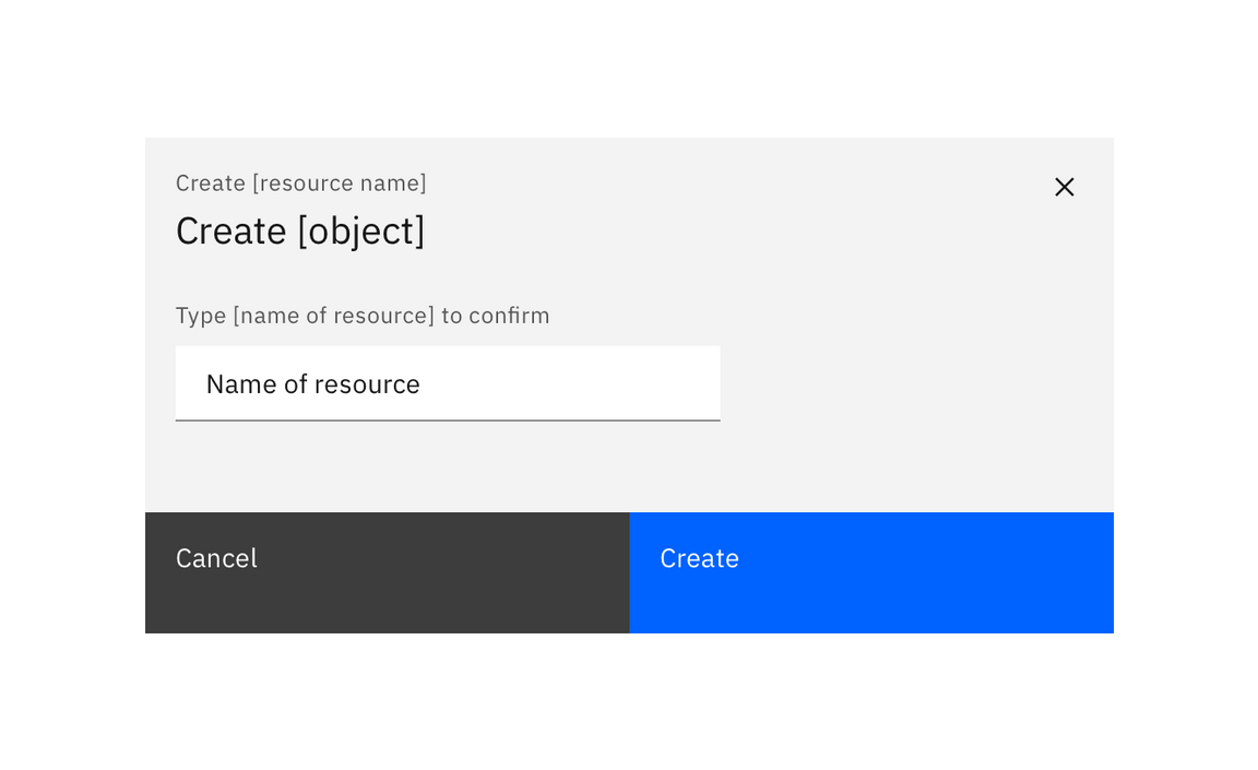
Example of a standard creation modal
Side panel
Consider using a side panel to take advantage of the added screen real estate and keep the user in the context of where they are working. You may choose to use either the slide in or slide over panels.
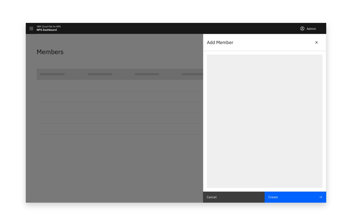
Example of a side panel creation flow
Full page
If your creation flow consists of multiple fields and/or supporting imagery, consider the full page option to take full advantage of the screen’s available real estate.
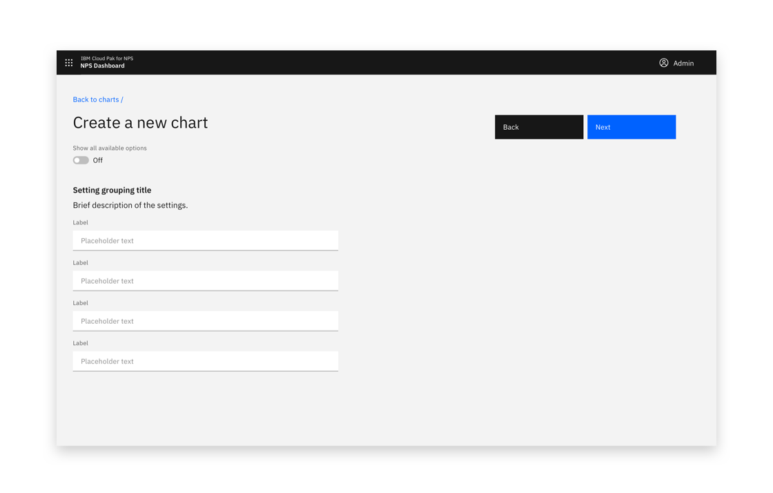
Example of a full page creation flow
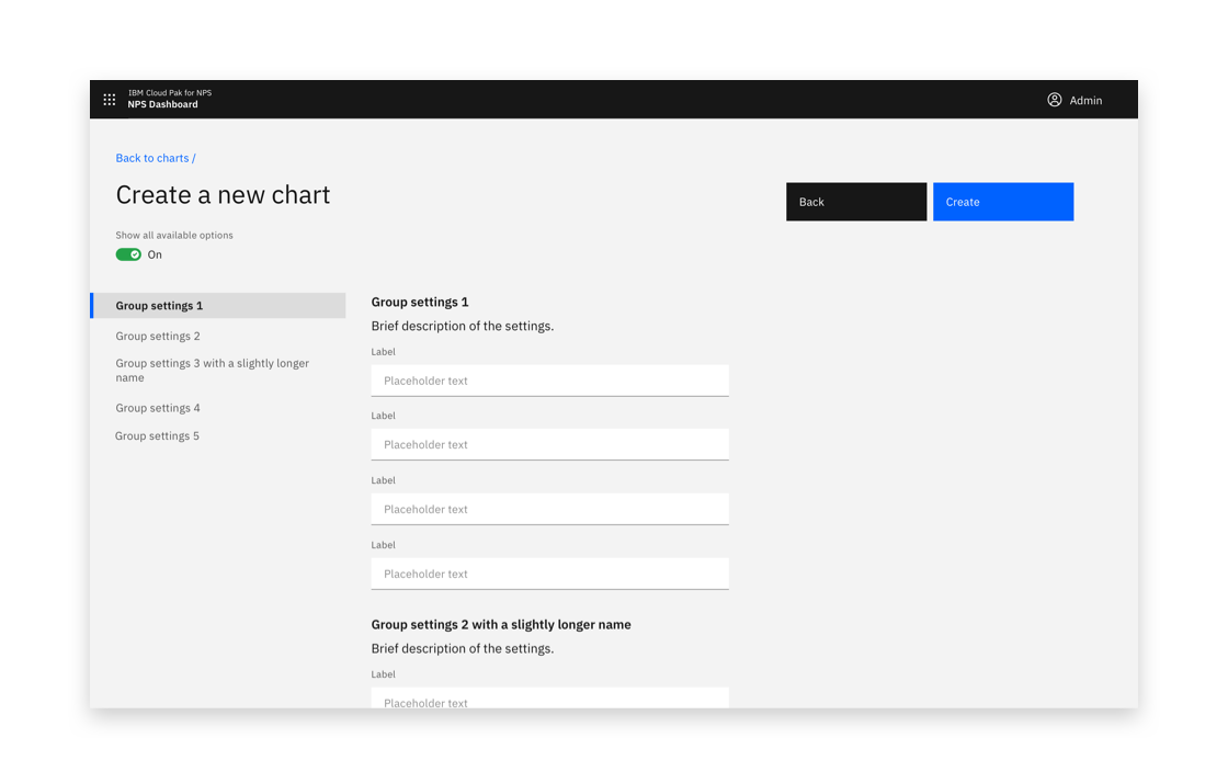
Example of a full-page creation flow
Multistep creation
If the creation task is complex, consider whether breaking the process up into steps could help the user. Consider displaying related or dependant options together.
Multistep creation follows the same principles as Standard creation, with the addition of steps.
Side panel
Consider using a side panel to take advantage of the added screen real estate and keep the user in the context of where they are working. You may choose to use either the slide in or slide over panels.

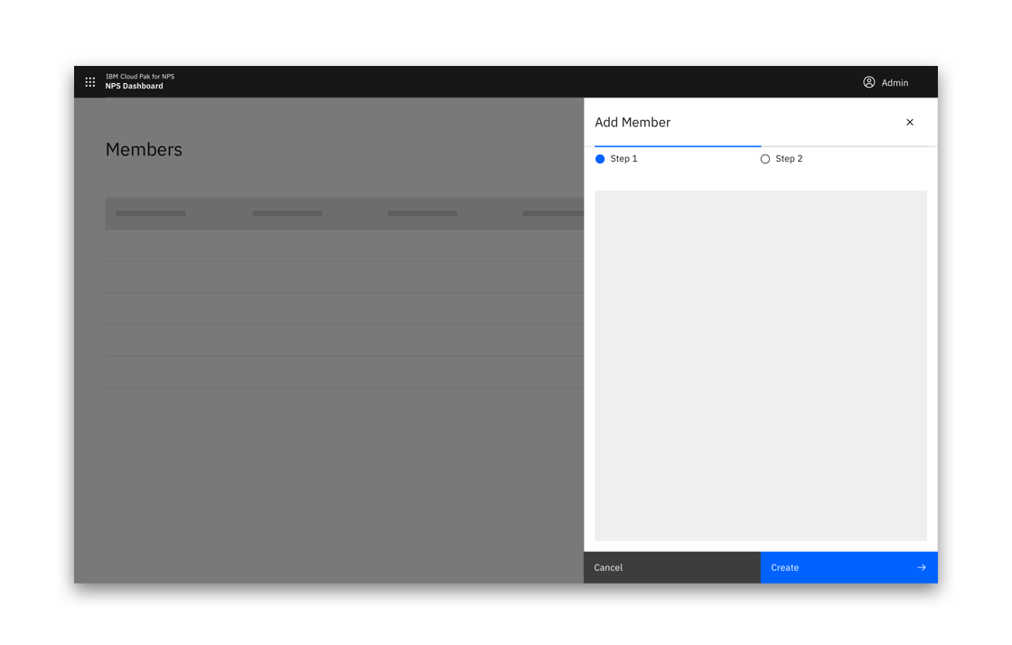
Example of a side panel multistep creation flow
Full-page multistep
If your creation flow consists of multiple fields and/or supporting imagery, consider the full page option to take full advantage of the screen’s available real estate.
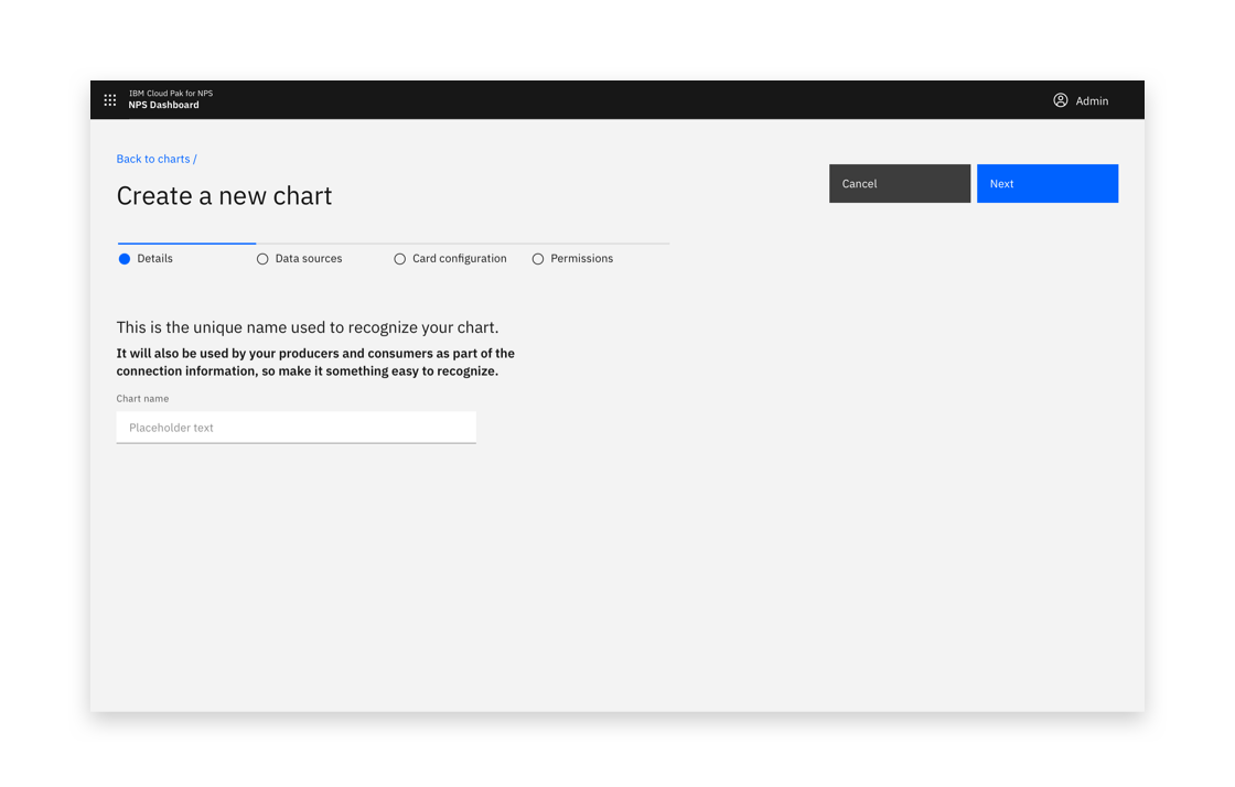
Start of multistep creation flow
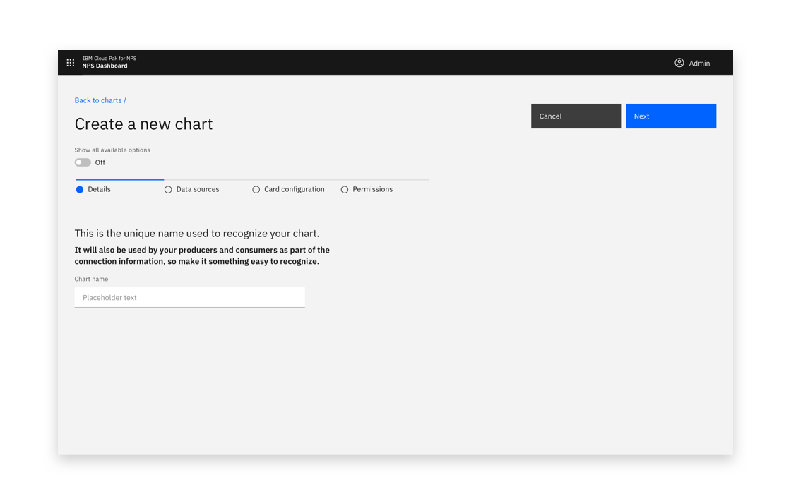
Multistep creation flow with view all options toggle
Anatomy
Button position
On a larger screen, buttons should always remain visible to the user.
Buttons should be located in the top right and should stick upon scrolling.
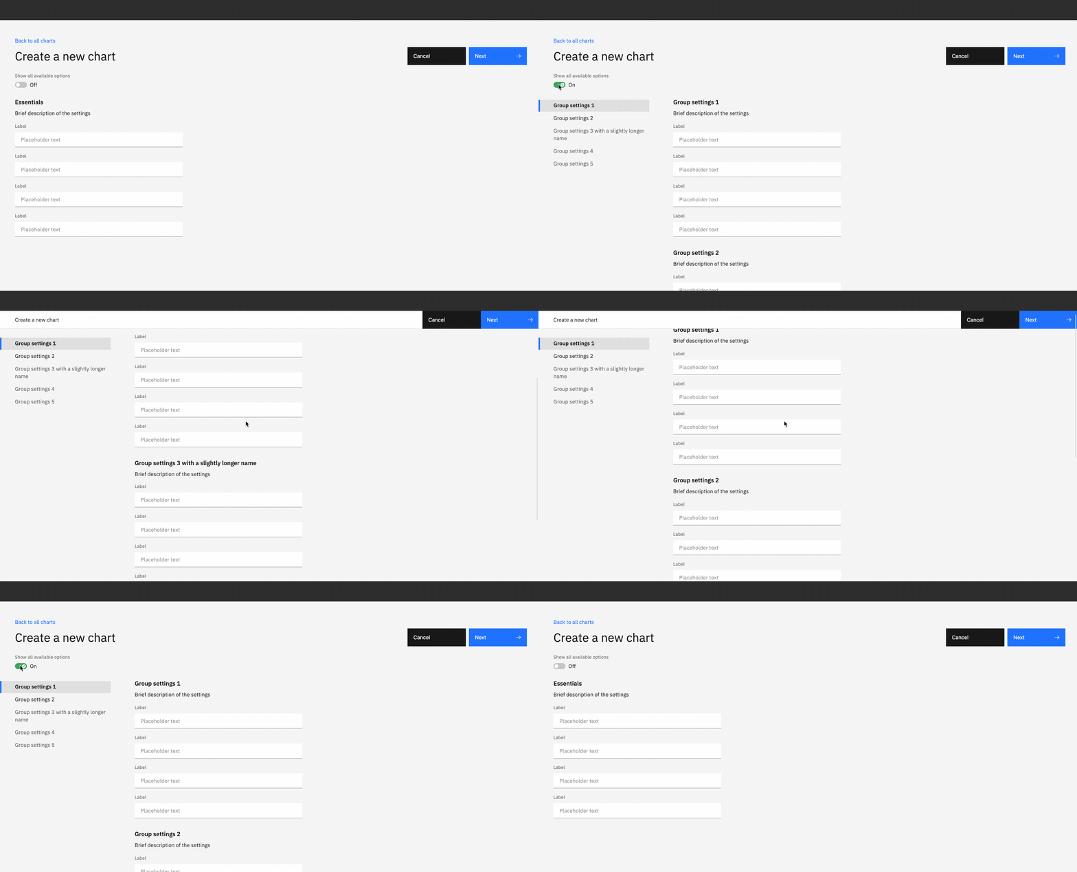
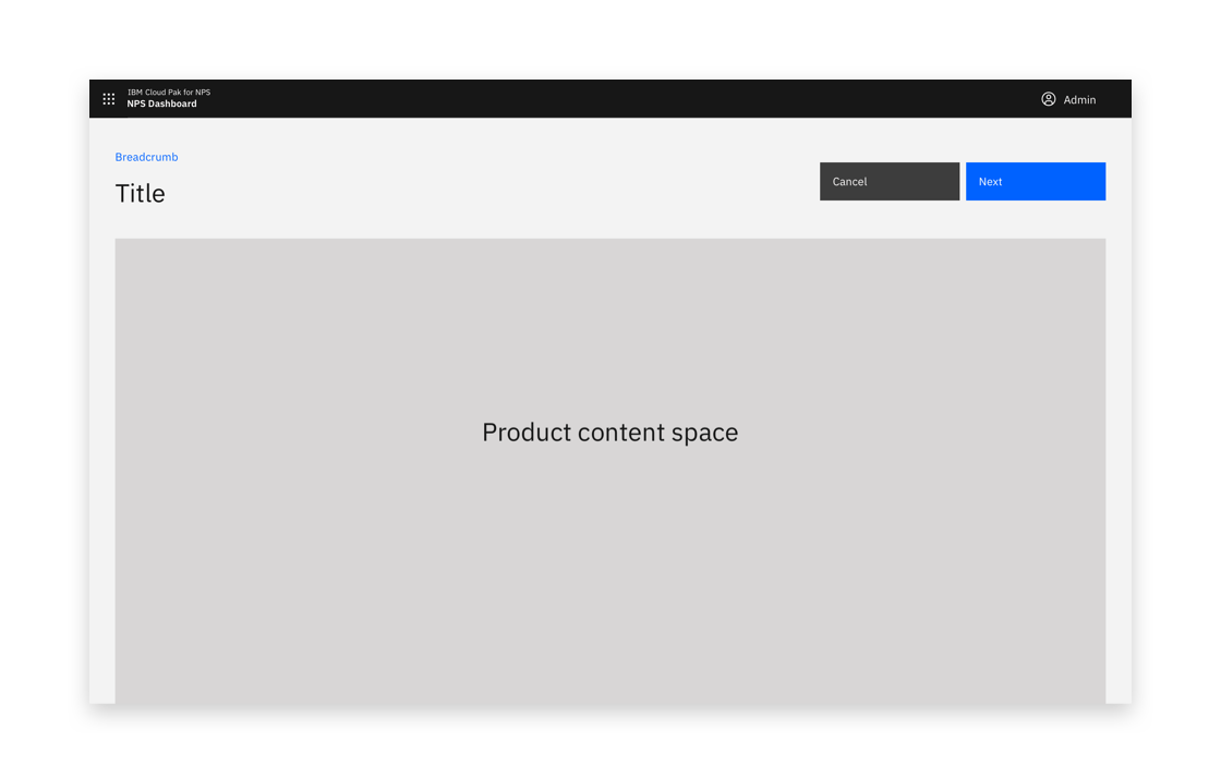
Buttons should be located in the top right
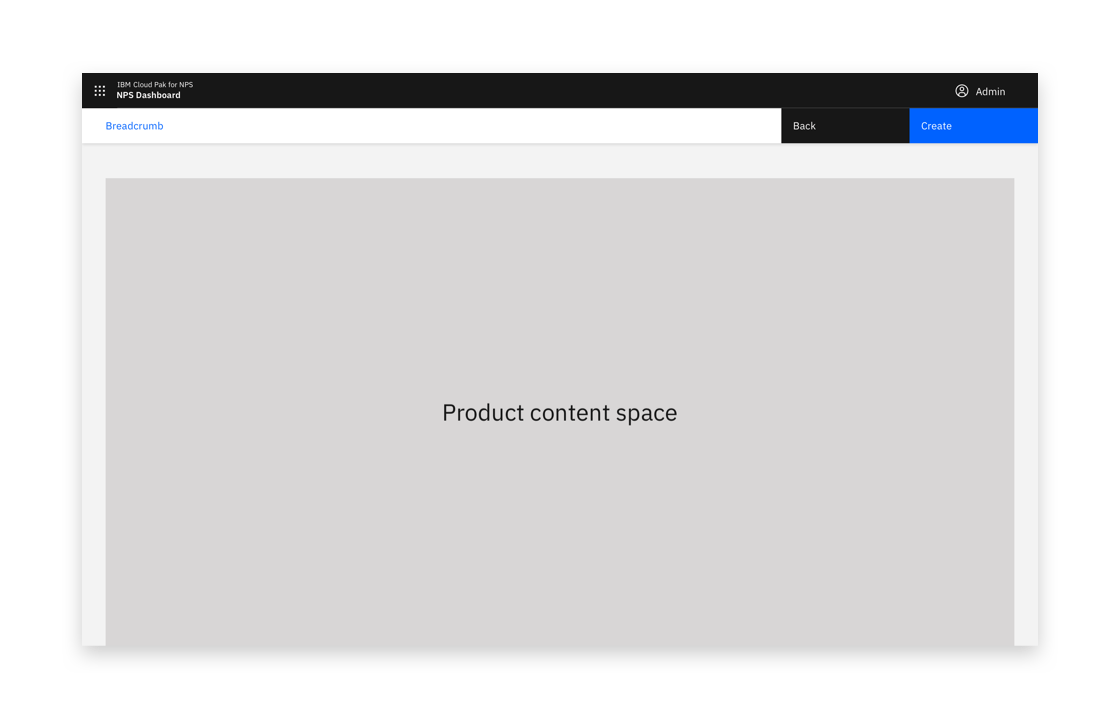
Buttons should stick upon scrolling.
When the full-page dialog is viewed in mobile, the buttons are positioned at the bottom of the screen.
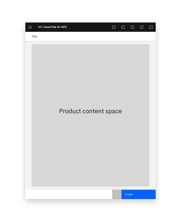
Example of full-page option on mobile
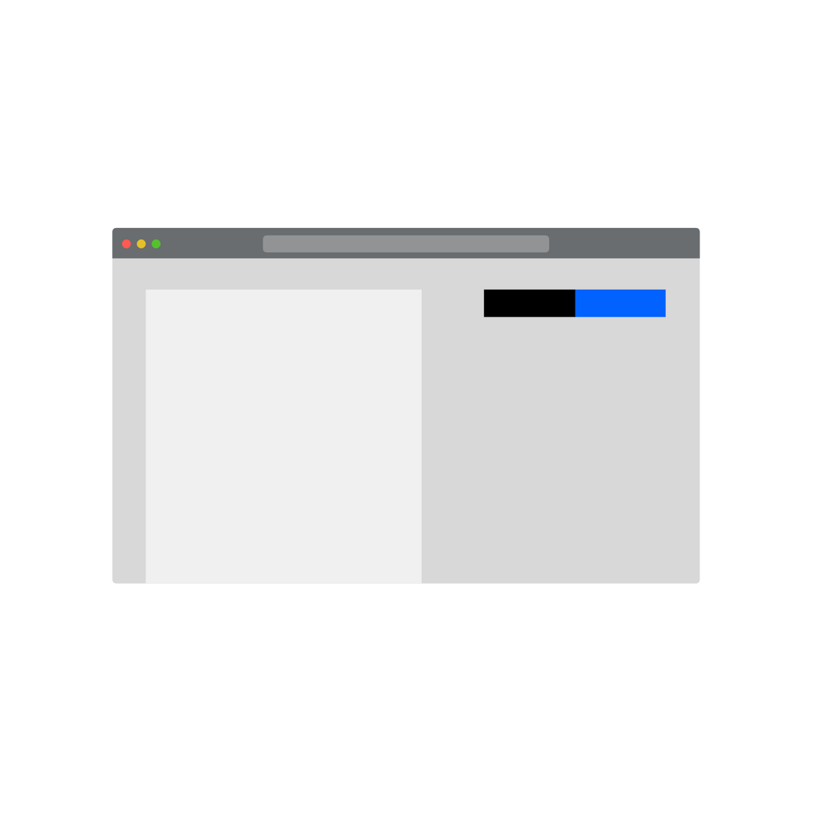
Buttons should stick upon scrolling so they are always visible.

If an illustration or image is displayed, buttons should be displayed above the image.
Including an image or illustration
If including a supporting image or illustration, place the image on the right-hand side.
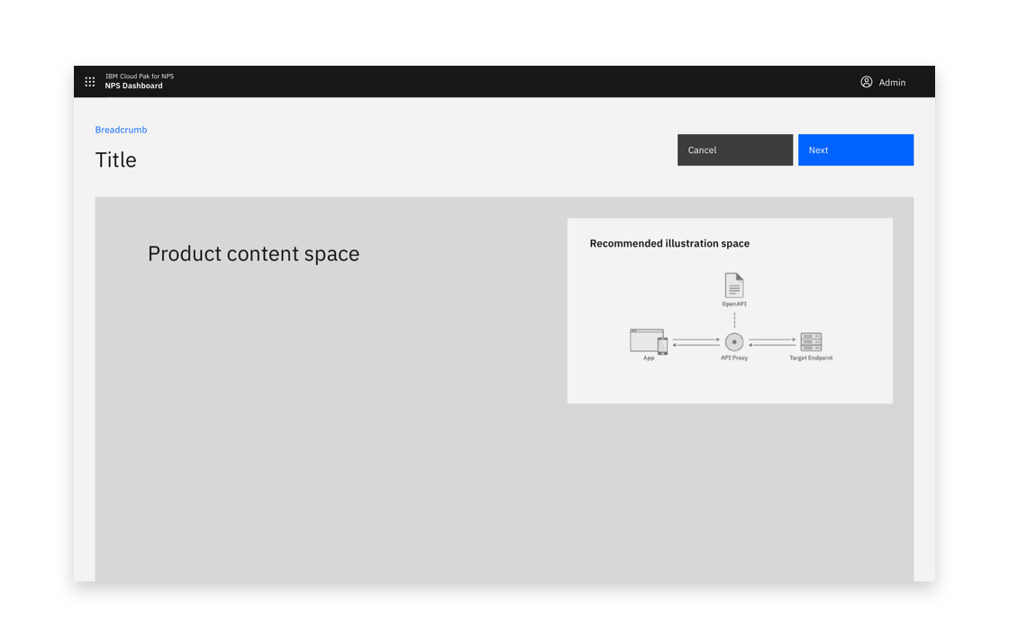
Example of supporting image placement
Show all available options toggle
The toggle should be used to avoid overwhelming users, while still allowing users to access all options. It can be applied to the side panel and the full page dialog.
Consider having a minimal set of options visible by default, offering the ability to chose if the user wants to expose more options.
If the user switches to this mode, remember this for when they next perform the same task.
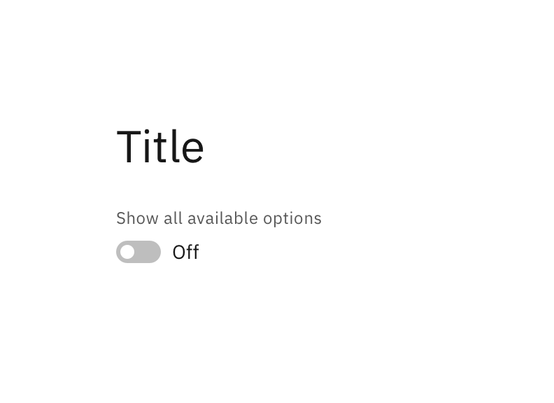
Show all options off
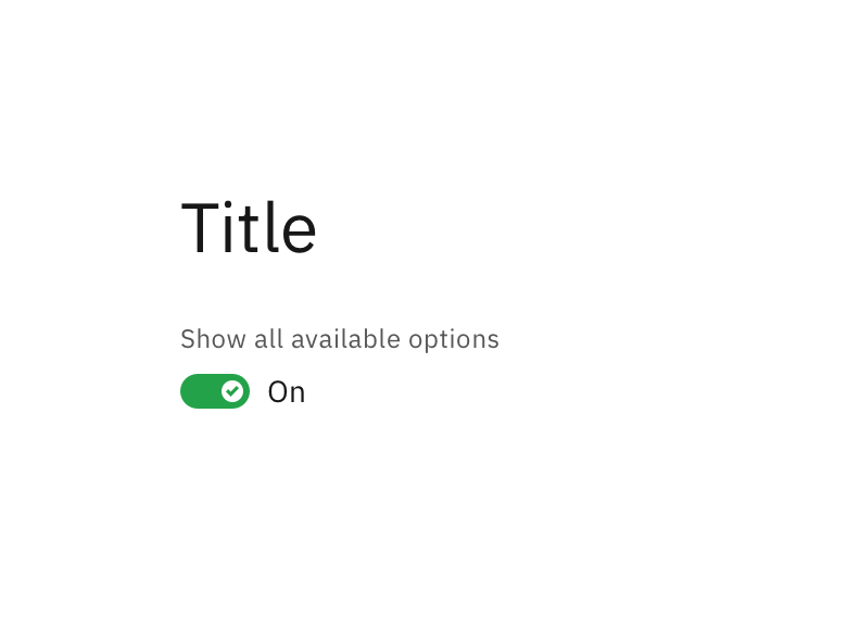
Show all options on

Show all options off
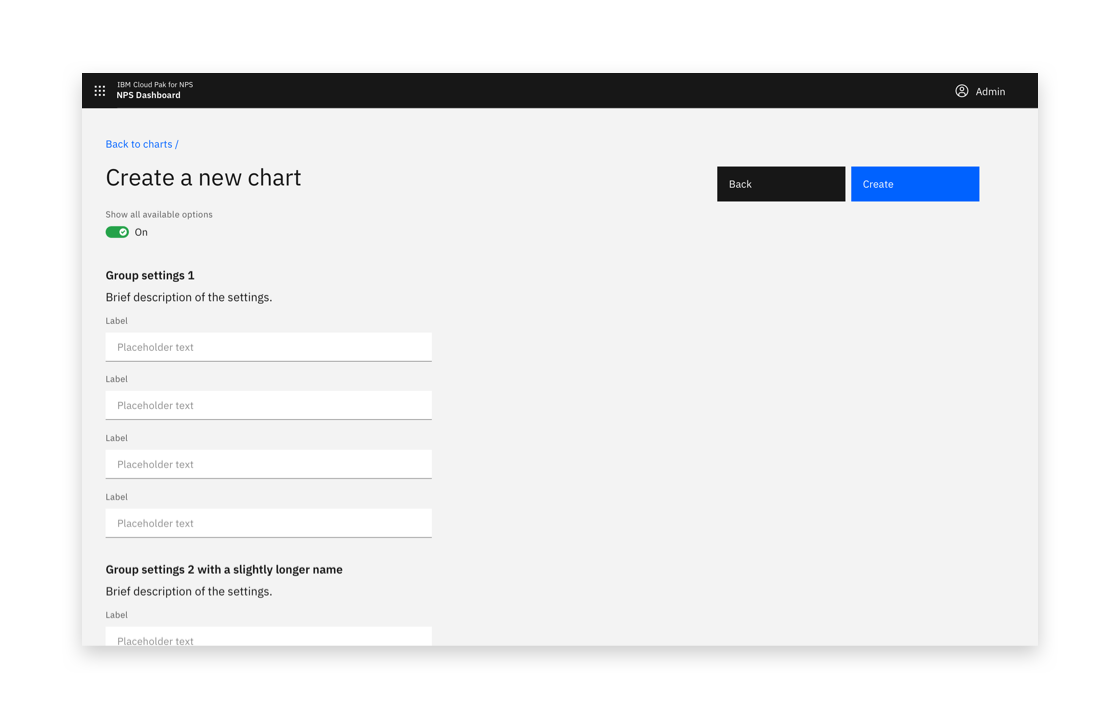
Show all options on

Show all options on and grouped
Confirmation
A notification banner can be presented to visually confirm when any create action is a success.
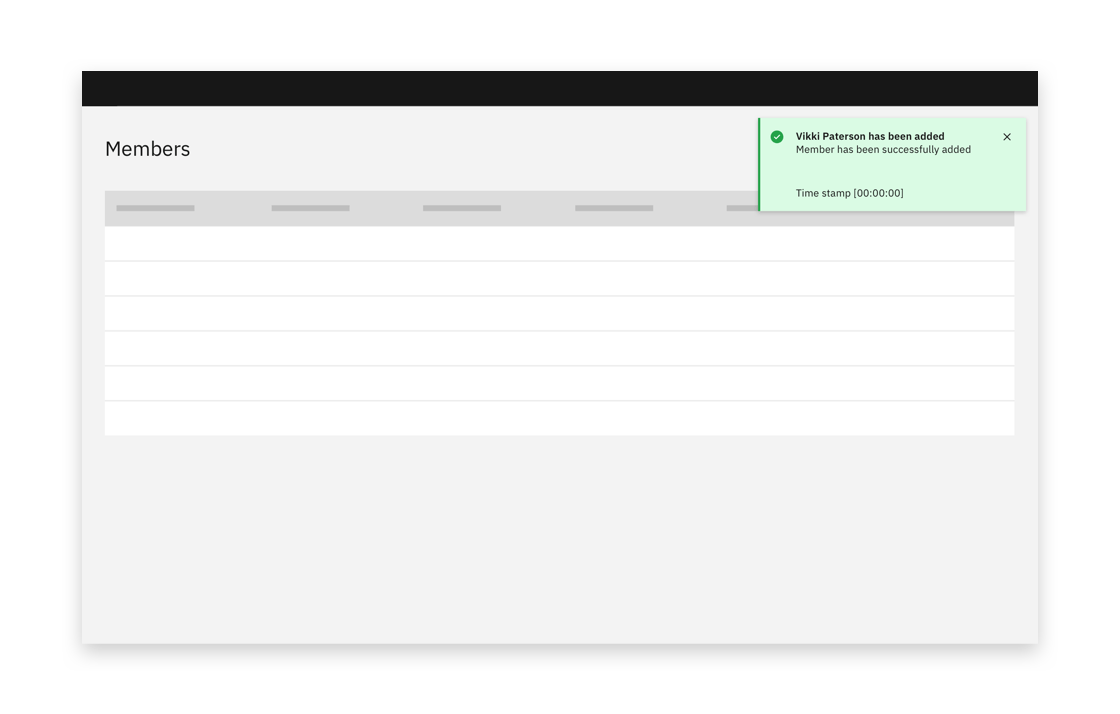
Example of a successful creation confirmation
Pre-create
A pre-create step occurs before the create flow starts. A common pre-create step is Create from template.
A pre-create step is usually combined with a full-page create flow. It can also be used in combination with a side panel create flow. A pre-create step can be used in combination with a single-step or multistep create flow. A multistep flow starts after the pre-create step is complete.
Consider reminding users of the option they choose in pre-create in the rest of the create flow.
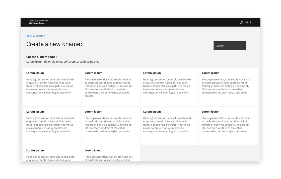
Example of a pre-create view
Aim to limit the number of pre-create options. If there is a very large number of options, pre-create options can be sorted into groups.
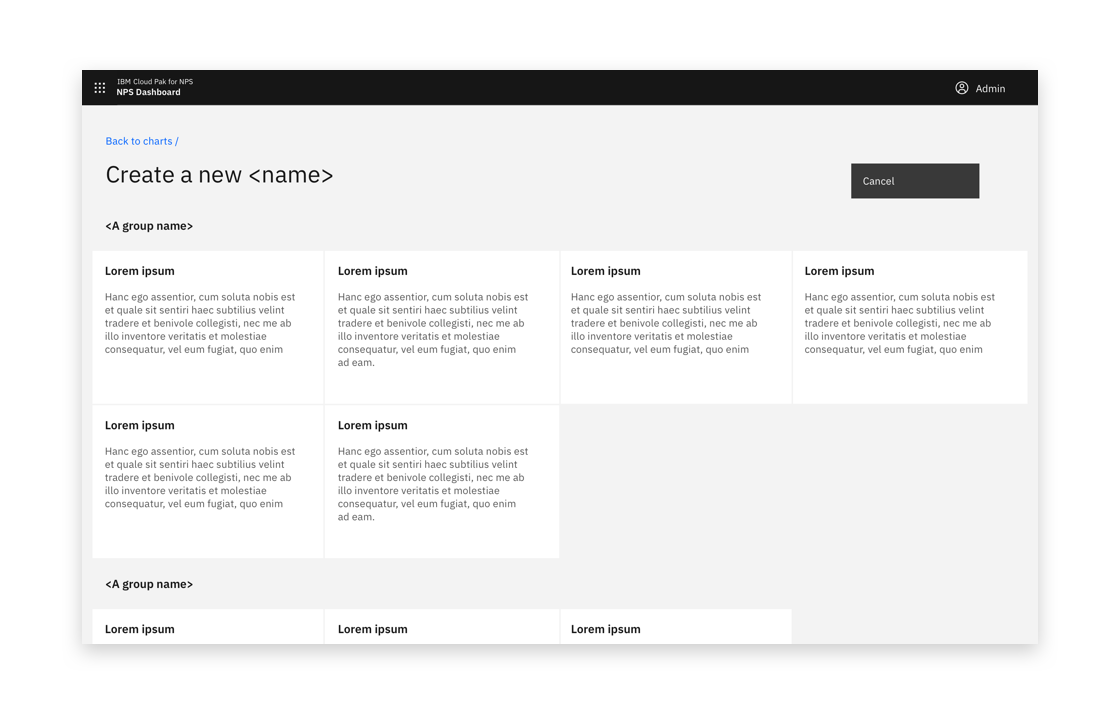
Example of pre-create with groups of tiles
If necessary, a dropdown selection box or similar component can be required before the pre-create options.
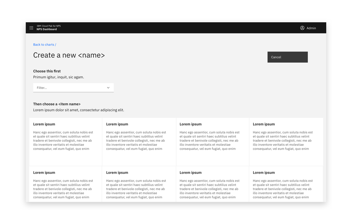
Example of pre-create with a dropdown input